New rules: AI and the crumbling UI consensus
Nothing has changed, everything has changed
In the early 1990s, the Gracie brothers - intense and now legendary martial artists from Brazil - moved to the US, and brought with them a new variant of jiu-jitsu. It completely shook up the fighting world. In 1993 - the year before I was born - the first Ultimate Fighting Championship event took place, pitting different disciplines against one another.
It was complete carnage. A sumo charging at a boxer. A wrestler bodyslamming a taekwondo champion.
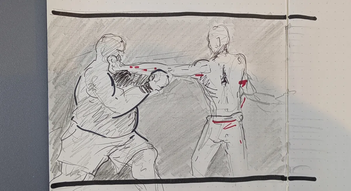 Chaotic matchups
These bloody, brutal and exhilarating contests rapidly grew in popularity. And as they did, the raw data of thousands of rounds of combat - and a gradual introduction, then tightening of the rules - meant that the chaotic variation of the early days slowly began to subside. It was replaced by a homogenous blend of grappling and striking, with more athleticism, underlying infrastructure and funding.
Around the same time, another innovation was picking up unstoppable momentum: the web browser. This was one of the first mass-market graphical user interfaces (or UIs). It provided an accessible way for normal people - not just the tech-savvy early adopters - to interact with the internet (and computers more broadly).
A similar pattern emerged: early chaos, creativity and variation, eventually reaching an equilibrium. Millions of users interacting with millions of components on millions of interfaces gradually calcified into the familiar elements of the UI consensus: the hamburger menu, tiles, a search bar, breadcrumbs.
Refinement culture
No grand internet committee decreed these interaction patterns should be universally adopted. They just gradually won out, because people got used to them - and then expected they'd be there every single time they opened their browser. As Steve Krug's seminal (and still relevant) book sets out, when it comes to UI... Don’t Make Me Think.
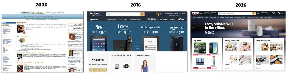 The evolution of a familiar UI
Just look at the Amazon home page over the course of twenty years. The newer iterations are a little slicker, a little cleaner - a textbook example of refinement culture - but recognisably the same animal. Of course, the underlying technology is far more impressive. It does more, and does it faster and more securely, for more people. It's undeniable the last few decades have seen huge leaps in where stuff is hosted and how it’s built. But the way you use sites like this is essentially the same.
Now, though, this decades-held consensus is starting to crack.
Someone brought a shotgun
Let’s go back to UFC for a moment. Picture this: you’re a fighter who has trained their whole life for an important bout. You walk into the Octagon, your heart pounding. You hear the crowd roar. Your opponent enters… and they're holding a shotgun.
What the hell just happened?
The optimal style - the tried and tested ground and pound, takedown defence, striking from guard - is suddenly hopelessly outdated. The rules have changed overnight.
This is where we stand with UI. The shotgun, in this scenario, is AI. It’s changing the design process, the tech stack, and fundamentally how users interact with computers. The constraints that created the consensus are crumbling before us.
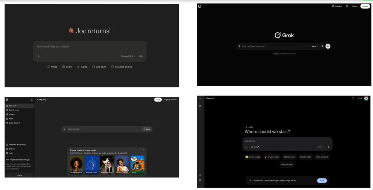
The holding pattern
Adding AI to your product right now often boils down to a text input field - a place to type your prompt - and a response. This means you have to abstract your desired outcome into a sentence - a sentence that could be misinterpreted.
 I'm seeing quadruple...
In many ways, it’s a regression from the craftsmanship and clarity that the existing UI consensus brings:
- Precision vs. ambiguity. A toggle or slider that lets you precisely adjust a value in a reliable gesture now becomes “make it a bit brighter”, with the risk the model overshoots or misinterprets which thing you want brighter
- Lost shortcuts. Keyboard shortcuts and muscle memory that let experienced users fly through a flow they’ve done thousands of times, replaced by typing full sentences that the model might misconstrue
- Ease of discoverability. Well-designed interfaces show you what’s possible, a gentle push in the right direction (e.g. a smooth onboarding flow). A blank chat box is like a blank page: it hides options and forces you to know exactly what to ask for before you ask
- Knowing vs. guessing. Traditional UI gave deterministic outcomes (e.g. press X, get Y). Prompting gives probabilistic ones - which are sometimes - and perhaps increasingly - brilliant, but often just mediocre slop
- Context loss. Switching between AI tools or maintaining context across sessions is far clunkier than deliberately tabbed interfaces / persistent side panels built for it
Novel interaction patterns like the prompt / response model look and feel exciting until you have to use them for work every day.
Maybe this design volatility shouldn’t be surprising. Telephony took about a century to get from the earliest exchanges to the smartphone, and web UI is barely a generation old. We might be nowhere near the new consensus. Or, perhaps it’s already set and chat is here to stay - habits are sticky (Don't Make Me Think, remember?). Or, entirely new interaction patterns could emerge - UI might become dynamically generated by agents on the fly, bespoke for every use and every use case. Voice might become viable at scale.
Whichever way it goes, I’m certain that the current holding pattern of ‘slap a chat box on it’ will not be the final answer. It's just the first thing that worked for a mass audience. We're back to the early days of UFC, where nobody has figured out where the hell this thing is going. The selection process is running again from scratch.
What the new rules can’t lose
It’s worth noting that despite the UI consensus on the whole holding, there have been many meaningful improvement
Accessibility
UIs have become far more accessible, with the increased adoption and familiarity with WCAG guidelines - a shared framework / understanding for helping people with different accessibility needs do what they need to do.
Vibe-coded ephemeral UIs that ignore this foundational work risk alienating people who already find digital services difficult to navigate. This is not some minor edge case - it’s [1 in 4 people in the UK](tab: https://www.lloydsbankinggroup.com/assets/pdfs/media/consumer-digital-index/2025/2025-consumer-digital-index.pdf).
A great example of an accessible, open design system in the public sector is the UK Government Design System. Hundreds of services, tens of thousands of battle-tested screens, patterns and flows that help people interact with government services consistently and with confidence. Consistency in how stuff looks and feels, trust and accessibility aren’t nice-to-haves: they are fundamental to ensuring people can interact with the services they need.

Information architecture
A shiny set of screens on top of a broken data model, inconsistent naming conventions, and gaps in logic doesn't help anyone. The underlying 'shape' of the information people need to get at - the information architecture - matters regardless of the UI that sits on top of it.
And if, in not too distant future, there’s much less focus on “a person doing stuff by clicking and scrolling” and more “hooking an agent up via model-context protocol”? Then the right context - informed by a well-designed information architecture - will be even more important without a human to intuit and navigate any gaps.
Opinionated design
Not everyone will want to vibe-code their own tools or journeys - even if it’s increasingly easy to do so. When the typewriter was invented, you might have assumed everyone would write a book because many of the structural barriers had collapsed. Most people didn’t - not because they couldn't, but because they simply didn’t want to.
And so we'll continue to need creative, practical problem-solvers to think carefully about how best to design well-crafted, opinionated UIs more than ever in the age of carelessly generated slop.
The next 30 years
My son has just turned 2. I can’t help but wonder how we'll all be interacting with computers by the time he's my age.
But what I do know for sure is that I don't want the experience of using computers to do stuff - whether it’s to looking up directions, ordering a pizza, finding out what benefits you’re entitled to, or editing a wedding photo - to be materially worse than it is now.
The existing UI consensus took decades to build. Whatever comes next, however drastically AI changes things, whatever the new rules end up looking like - let's not throw away the progress we've made.